Storybook in React Native
Author
Luka Patrun
Date
Category
Development

How would you like a design system tool that greatly helps you develop, maintain and onboard new coworkers on the project? Well, look no more because the perfect tool is already here in the form of Storybook. This is a robust tool that runs outside the main app and allows us, the developers to create components independently.
At Collective mind, we use Storybook to boost our performance and to make developing easier, especially for our new colleagues that are in the onboarding process on the project. With a Storybook it is very easy to write documentation for your application by doing components independently.
So without further ado I would like to invite you to continue reading this article we will start with a couple of words about Storybook and then we will continue with the installation process and how you can use it inside of your project and in the end I will give you a link to the code so you can check everything for yourself.
STORYBOOK - in their own words
This is what they say on their site:
“Storybook is an open source tool for building UI components and pages in isolation. It streamlines UI development, testing, and documentation.”
As they say it is an open source tool which means that you can use it freely and help develop it if you notice some bugs and you found the solution. It can be used with a lot of libraries, frameworks and whatnot like: react, react native, vue, angular, web-components, ember, html , mithril, marko, svelte, riot, preact and rax.
When to use it
I guess the next obvious question is when you should use the Storybook? Is it something you should use on every Project or not? I personally believe you should use it as often as possible because it can really help you a lot, but sometimes it can be too much work if the app is not that big and it doesn't really bring a lot of benefits in having the Storybook to check the whole app.
Apart from that it is not really that hard to implement the Storybook inside your project and after you read this article you will be able to implement it in your applications.
Setup
Alright, alright, alright, I hope that you're warmed up and that your machine (preferably mac) is on and that you can follow and copy what I'm doing here. Our first goal is to get to the default Storybook and after that we will begin to modify it to suit our needs.
For the sake of the length of this article, I will assume that you have already set up your react native development and I will proceed with the project installation.
- Install RN project with typescript because we are pros
npx react-native init storybookArticle --template react-native-template-typescript - Install Storybook in the project
npx -p @storybook/cli sb init --type react_nativeSay yes to the Storybook server. And when the installation is done, you should see a message saying how you should run it. - Install these packages
yarn add -D @storybook/addons @storybook/theming react-native-storybook-loader
First two packages will give us the possibility to modify the look and feel of the storybook inside the browser. The third one will make our life easier so we don't have to manually include every story to be displayed.
Startup
Just add export {default} from './storybook'; at the end of App.tsx and run yarn android or yarn ios. Once you fire it up you should be able to see the message saying
"Please open navigator and select a story to preview."
And if you do that you will see three stories, two of them are stories for the button and one is the welcome screen. If you see that, so far so good.
The other way of using it would be with browser, ie. you will use a browser to change the stories. To use it that way, just go:
yarn storybook
yarn ios
I am using a MacBook Pro with M1 and right now this does not really work with android. This is the workflow with android
yarn storybook
yarn android
Once it has turned on, type
adb reverse tcp:7007 tcp:7007
and hit double r inside the emulator.
To be honest I always try to use the Storybook with a real device or iOS simulator and to have the commands for the Storybook inside the browser.
For that to be possible, we have to make some adjustments.
First we will upgrade our Storybook script so we no longer need to add new imports to the App.tsx and mess around with it.
Our new Storybook script looks like this now:
"storybook": "(adb reverse tcp:7007 tcp:7007 > /dev/null || true) && echo 'y' | start-storybook -p 7007 | react-native start --projectRoot storybook --watchFolders $PWD"
I don't know about you, but to me this looks perfect. Long story short this will allow us to run storybook without the need to comment in or out anything from the App.tsx.
Inside storybook/index.js inside change your StorybookUIRoot to be like this
const StorybookUIRoot = getStorybookUI({
  asyncStorage: null,
});
So we can run this on a physical device and give your app a name in AppRegistry.registerComponent.
Now you can start the whole thing up again with yarn storybook and yarn android and you should see everything like before but this time we did not have to comment out anything. Since we will be managing stories with our browser we can add “onDeviceUI: false”, just below asyncStorage. Now we will be able to see everything how it would look in an opened app and this will open us a possibility to do some visual regression but more on that some other time.
Theming
Storybook theming allows us to change some things regarding how it looks. For this article we will change a couple of things: brand title, brand url and brand image. Inside the Storybook folder create a js file, for example: CustomTheme.js. Inside of it we can make changes to the theme. Because this article is “sponsored” by Collective mind, I think it's fair to use it for this example. As you can see, brand title and url are straightforward and image has to be imported just like anything in the react.
import {create} from '@storybook/theming';
import cmLogo from '../assets/cmLogo.png';

export default create({
   base: 'light',
   brandTitle: 'Collective:mind',
   brandUrl: 'https://collectivemind.dev/',
   brandImage: cmLogo,
});
To apply these changes, go to storybook/addons.js and add this piece of code.
import {addons} from '@storybook/addons';
import yourTheme from './CustomTheme';

addons.setConfig({
  theme: yourTheme,
});
And our Storybook now looks like this.

You can learn more on the subject of theming by reading the official documentation.
Components
To be able to make stories we will make some components because that is the usual workflow. We can make header component, custom input component, custom button component and lets say a calendar component. This will be enough components to get a grip of how things work and to try some things. And to finish, we will place everything on one screen.
Button
You can make it inside src/components/Button.tsx to keep everything neat and tidy. We will make this component in such a way so we can use some addons from the Storybook. Our button will take a couple of props, just like any component, so it could be used throughout an app. The most important props for us are: backgroundColor, textColor, fill and borderColor because we will be able to play with them inside the Storybook.
import React from 'react';
import { StyleSheet, TouchableOpacity, Text, ViewStyle, ColorValue } from 'react-native';

interface Props {
 text: string;
 backgroundColor?: ColorValue;
 textColor?: ColorValue;
 fill?: boolean;
 borderColor?: ColorValue | undefined;
 additionalStyle?: ViewStyle;
 onPress: () => void;
}

function Button({ text, backgroundColor = 'black', textColor = 'white', fill = true,
 borderColor = 'transparent', additionalStyle, onPress }: Props) {
 const buttonStyle = React.useMemo(() => {
   return {
     backgroundColor: fill ? backgroundColor : 'transparent',
     borderWidth: 1,
     borderColor: borderColor,
   };
 }, [backgroundColor, fill, borderColor]);

 return (
   <TouchableOpacity
     style={[styles.wrapper, additionalStyle, buttonStyle]}
     onPress={onPress}>
     <Text style={{color: textColor}}>{text}</Text>
   </TouchableOpacity>
 );
}

const styles = StyleSheet.create({
 wrapper: {
   alignItems: 'center',
   justifyContent: 'center',
   paddingVertical: 12,
   paddingHorizontal: 16,
   borderRadius: 4,
 },
});

export default Button;
Delete everything inside storybook/stories and make Button.stories.tsx inside storybook/stories/components and paste this piece of code.
import React from 'react';
import {storiesOf} from '@storybook/react-native';
import {action} from '@storybook/addon-actions';

import Button from '../../../src/components/Button';

storiesOf('Button', module).add('Default', () => (
 <Button text="Default" textColor="white" onPress={action('Default button')} />
));
And now if you try to run it you will get an error because we deleted a file that contained the imports of stories, but that is not an issue because we were going to replace it anyways. We will automate the process of importing the stories so we don't have to do it manually every time we make a new story. First thing you need is
"scripts": {
	…
	"prestorybook": "rnstl",
	…
}
In the scripts. Secondly, below scripts add this code of block to tell the Storybook loader where to look for stories
"config": {
   "react-native-storybook-loader": {
     "searchDir": [
       "./storybook"
     ],
     "pattern": "stories/*/*.stories.tsx",
     "outputFile": "./storybook/storyLoader.js"
   }
},
You should already have the output file “storyLoader.js” because we installed the react-native-storybook-loader. In storybook/index.js import the storyloader and change how we import stories:
import {loadStories} from './storyLoader';
configure(() => {
 loadStories();
}, module);
Now run yarn prestorybook -> yarn storybook -> yarn android/ios and you should get a storybook with one story of default button.

Alright, alright, alright.
Stuff is working but it seems a little bit clumsy in having a button so close to the top so I suggest
we use some kind of wrapper so our component is in the center of the screen.
To do that we will add Wrapper.tsx inside the Storybook and in terminal type yarn add react-native-safe-area-context.
import React, {ReactNode} from 'react';
import {StyleSheet} from 'react-native';
import {SafeAreaView} from 'react-native-safe-area-context';

interface Props {
 children: ReactNode;
}

function Wrapper({children}: Props) {
 return <SafeAreaView style={styles.container}>{children}</SafeAreaView>;
}

const styles = StyleSheet.create({
 container: {
   backgroundColor: '#ccc',
   flex: 1,
   justifyContent: 'center',
   alignItems: 'center',
   paddingHorizontal: 16,
 },
});

export default Wrapper;
To use this wrapper we will introduce decorators.
So as it says on Storybook website: “A decorator is a way to wrap a story in extra “rendering” functionality.
Many addons define decorators to augment your stories with extra rendering or gather details about how your story renders.”
Read more about decorators here.
To use wrapper, inside Button.stories.tsx before the .add add this line
.addDecorator((story) => <Wrapper>{story()}</Wrapper>)
and add the import of Wrapper.
Now our story looks a little bit different because the button is in the middle and no longer takes up all width. Next I want to add rest of the stories of the button, at the top we must import knobs:
import { text, color, boolean } from '@storybook/addon-knobs';
And now the rest of the stories:
 .add('Inverted', () => (
   <Button text="Inverted" backgroundColor="white" textColor="black" onPress={action('Inverted button')} />
 ))
 .add('Outline', () => (
   <Button text="Outline" textColor="black" borderColor="black" fill={false} onPress={action('Outline button')} />
 ))
 .add('All', () => (
   <View style={styles.container}>
     <Button text="Default" textColor="white" onPress={action('Default button')} />
     <Button text="Inverted" backgroundColor="white" textColor="black" onPress={action('Inverted button')} />
     <Button text="Outline" textColor="black" borderColor="black" fill={false} onPress={action('Outline button')} />
   </View>
 ))
 .add('with Knob', () => (
   <Button
     text={text('Label:', 'Knob button')}
     backgroundColor={color('Background color:', 'black')}
     borderColor={color('Border color:', 'transparent')}
     fill={boolean('Fill:', true)} textColor={color('Text color:', 'white')}
     onPress={action('Black button')}
   />
 ));

const styles = StyleSheet.create({
 container: {justifyContent: 'space-around', flex: 1},
});
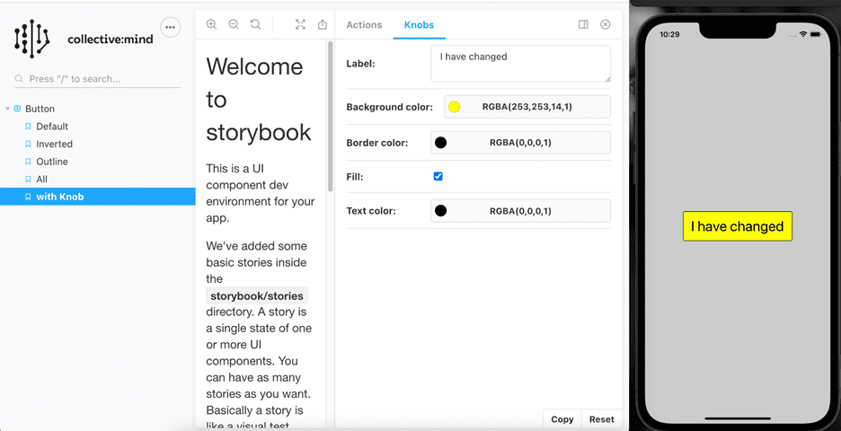
Don't forget to add StyleSheet import to the react-native. With this you will have a couple more buttons to look at but if you check the last one you will notice something different called knobs. Knobs allow us to edit props dynamically using the UI. And as you will be able to see in the next screenshot it's a really useful tool. In this example we will play with button text and color, but there are much more possibilities.

This used to be the default button with black background and white letters but that is no longer the case as you can see. Below you can see which knob types are available in Storybook.
Knob types available in Storybook
- • text
- • number
- • boolean
- • color
- • date
- • array
- • object
- • files
- • button
- • radios
- • select
Next thing I want to show you is the calendar component.
With this component I will show you actions addon.
First we have to add react-native-calendars to our project. Make CalendarPicker.tsx inside src/components and add this code.
import React from 'react';
import {Text, View, StyleSheet} from 'react-native';
import {Calendar, DateData, LocaleConfig} from 'react-native-calendars';
import Button from './Button';

interface Props {
 onSaveDate: (value: any) => void;
 onCancelDate: (value: any) => void;
}

export function CalendarPicker({onSaveDate, onCancelDate}: Props) {
 const [selectedDate, setSelectedDate] = React.useState<DateData | null>(null);

 const pickDocument = () => {
   return null;
 };

 return (
   <View style={styles.container}>
     <Calendar
       style={styles.calendar}
       onDayPress={setSelectedDate}
       onDayLongPress={setSelectedDate}
       firstDay={1}
       onPressArrowLeft={subtractMonth => subtractMonth()}
       onPressArrowRight={addMonth => addMonth()}
       renderArrow={direction => (
         <Text>{direction === 'left' ? '←' : '➝'}</Text>
       )}
     />
     <View style={styles.wrapper}>
       <Text>SELECTED DATE: {selectedDate?.dateString}</Text>
     </View>
     <View style={styles.buttonsWrapper}>
       <Button
         text="SAVE DATE"
         textColor="black"
         borderColor="black"
         fill={false}
         onPress={() => {
           pickDocument();
           onSaveDate(selectedDate);
         }}
         additionalStyle={styles.marginRight}
       />
       <Button
         text="CANCEL"
         backgroundColor="transparent"
         textColor="black"
         onPress={() => onCancelDate(null)}
         additionalStyle={styles.marginLeft}
       />
     </View>
   </View>
 );
}

const styles = StyleSheet.create({
 container: {
   backgroundColor: '#fff',
   alignItems: 'center',
   justifyContent: 'center',
 },
 calendar: {
   marginBottom: 10,
   width: '100%',
   zIndex: 0,
 },
 wrapper: {
   alignItems: 'center',
   paddingHorizontal: 20,
   paddingVertical: 12,
 },
 buttonsWrapper: {
   flexDirection: 'row',
   justifyContent: 'space-between',
   paddingHorizontal: 12,
   paddingVertical: 10,
 },
 marginRight: {
   marginRight: 10,
 },
 marginLeft: {
   marginLeft: 10,
 },
});

LocaleConfig.locales['en'] = {
 formatAccessibilityLabel: "dddd d 'of' MMMM 'of' yyyy",
 monthNames: [
   'January',
   'February',
   'March',
   'April',
   'May',
   'June',
   'July',
   'August',
   'September',
   'October',
   'November',
   'December',
 ],
 monthNamesShort: [ 'jan', 'feb', 'mar', 'apr', 'may', 'jun', 'jul', 'aug', 'sep', 'oct', 'nov', 'dec'],
 dayNames: ['Sunday', 'Monday', 'Tuesday', 'Wednesday', 'Thursday', 'Friday', 'Saturday'],
 dayNamesShort: ['S', 'M', 'T', 'W', 'T', 'F', 'S'],
};
LocaleConfig.defaultLocale = 'en';

And now add the story to storybook/stories/components/CalendarPicker.stories.tsx:

import React from 'react';
import { storiesOf } from '@storybook/react-native';
import { action } from '@storybook/addon-actions';

import Wrapper from '../../Wrapper';
import { CalendarPicker } from '../../../src/components/CalendarPicker';

storiesOf('Calendar Picker', module)
   .addDecorator((story) => <Wrapper>{story()}</Wrapper>)
   .add('Default', () =>
<CalendarPicker
onSaveDate={action('onSaveDate')}
onCancelDate={action('onCancelDate')}
/>);
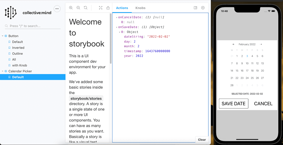
Storybook Addon Actions can be used to display data received by event handlers in Storybook. Let's now start the calendar story and select some nice date, for example 2nd of february 2022 and hit save date and cancel, we will see what data was received by event handlers.

As visible from the photo, we got data onSaveDate but onCancelDate we got null which was expected.
Not to stop on these two components I will make two more components,
one of them will be a header wrapper and a custom input component and for the end I will put
everything together on HomeScreen and for all that I will add just one more library:
react-native-svg.

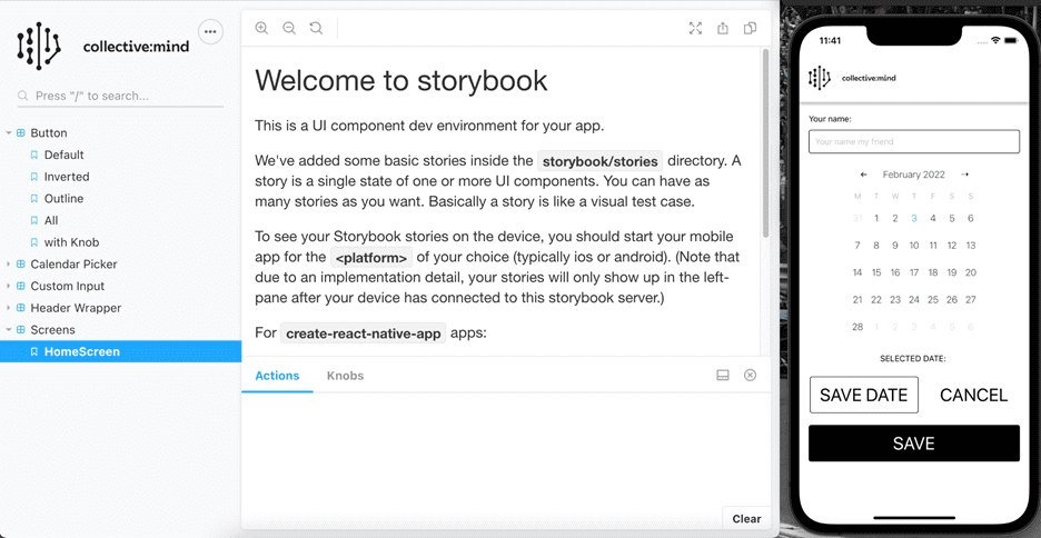
This is our HomeScreen with HeaderWrapper, CustomInput, CalendarPicker and Button components.
Summary
Firstly I want to thank you if you came to the end, there was a lot to read, but trust me, there was even more work for me. All in all this was actually just an introduction to the Storybook because there is so much more of it. I hope this article/tutorial will help you to start with Storybook and will encourage you to continue learning on the subject. I decided to go a little bit further with all this by implementing visual regression.
A visual regression test checks what the user will see after any code changes have been executed by comparing screenshots taken before and after code changes. This tool will help you make less mistakes while developing apps. And if you stick around you will be able to read that article as well.
For everybody who made it to the end and everything worked on the way, good job and you are now allowed to put on a smug face like one and only Jeremy Clarkson.

For everybody else, no worries, I got you covered. You can find code on my github here: https://github.com/lpatrun/storybookArticle.