Animated Times - Why Should You Use Animations
Author
Josip Blažević
Date
Category
Development


Standing out in the ever-increasing world wide web becomes increasingly difficult by every day. Pages without proper styling, intuitive layouts, without any animations become overshadowed by other pages that do have those features. Those simple animations are the one that make the page run smoother and more user friendly.
Animations should not be like nuclear physics. They should mostly be kept simple and they must not interfere with users normal behavior on the page.
Animating with Transition
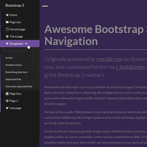
Have you even seen navigation bar just falling from the sky, just showing in front of you eyes instantly? How would you feel about such page?
Whenever something is moving on the page there should be some, even slightest transition added to give user smooth experience whenever they use the page.
Adding transitions is as simple as defining which CSS property you wish to add transition to and defining how long do you wish transition to last. To give your transition additional finesse, you should add a timing function to it. It can change how fast is your transition throughout all its way. Slow start and ending of animation? No Problem! Additionally, you can add delay to start of your transition if needed.
Transition is defined by writing:
/* transition: [transition-property] [transition-duration] [transition-timing-function] [transition-delay]; */

#navigation {
  transition: height 0.8s ease-in-out 0.1s;
}
If you wish to learn more about basic transitions you can look them up on W3 Schools Transition Tutorial.
Different transition on hover or state
Having animations which change your transitions when you hover or click an element are possible when using React or JavaScript in any other form. Changes on hover can be even done with basic CSS.
Transition changes on hover can be done by writing:
#navigation {
  height: 2em;
  transition: height 0.8s ease-in-out;
  transition-delay: 0.1s;
}
#navigation:hover {
  height: 50vh;
  transition-delay: 0.5s;
}
Transition changes on click or some other event while using React Material-UI library can be done by writing:
height: (props: ClassProps) => (props.open ? '100vh' : 0),
transition: 'height 0.5s ease-in',
transitionDelay: (props: ClassProps) => (props.open ? '0s' : '0.7s'),
Similar principle is used when using inline styles in React where you can pass a variable to an inline style or when using a DOM selector and overriding styles using JavaScript based on some variable or data-attribute.
Repeating animations with Keyframes
Keyframes are most used when you need to repeat animation without any action many times again. Animations with keyframes which run only once in its normal direction can often be replaced by simple transition. I will focus on repeating animations when using keyframes.
With keyframes you can define simple or complex animations which can repeat all the time while user is using the page. An example of using keyframes is Breathing scroll down button used on the home page of this site.
Keyframes are defined by writing styles which need to be applied during the animation by defining parts of animation. Animation CSS property is required to run the animation. Animation is defined by giving it animation name, duration, timing function, delay, iteration count and direction. Additionally, there are play state and fill mode states if needed.
Breathing button can be implemented using:
/* animation: [animation-name] [animation-duration] [animation-timing-function] [animation-delay] [animation-iteration-count] [animation-direction]; */

@keyframes breathing {
  from { transform: scale(0.9); }
  to { transform: scale(1); }
}

#scrollDownButton {
  animation: breathing 3s ease-in-out infinite alternate;
}
or instead of CSS, defined using React Material-UI library:
scrollDown: {
  animation: '$breathing 3s ease-in-out infinite alternate',
},
'@keyframes breathing': {
  from: {
    transform: 'scale(0.9)',
  },
  to: {
    transform: 'scale(1)',
  },
},
If animation needs to change some of CSS properties more than once in its runtime, instead of from-to, keyframes can be define with percentage points (e.g.: 0%-25%-50%-75%-100%).
To learn about CSS animation properties check out W3 Schools Animation Tutorial.
Using predefined transitions
There are many JavaScript libraries which can be added to projects that can simplify animation creation. There are libraries which can further simplify writing animations, greatly reduce coding of very complex animations, provide predefined transitions and many more.
Material-UI React library is the one which we often use for styling elements. This library also provides predefined transitions which can be used in a very simple way.
const [infoOpen, setInfoOpen] = React.useState(false);

const hadnleInfoClick = React.useCallback(() => {
  setInfoOpen((prev) => !prev);
}, []);

<div onClick={hadnleInfoClick} className={classes.infoContainer}></div>

<Collapse in={infoOpen} timeout={500}>
  <p className={classes.infoParagraph}>{content.info}</p>
</Collapse>
This code block shows how easily we can add transition on click. Collapse is element which changes height and adds transition to it. Only required property is "in" which represents Boolean state on which transition triggers. There are also properties like timeout for controlling transition duration, directions and other.
There are also other components which change opacity, both width and height, slide from the side of the screen or scale.
To find out more about Material-UI transitions you can read their Material-UI Transition documentation.
Simplifying complex animations
For Simplifying animations, there is one JavaScript library which we use that can reduce amount of written code even for simple animations, but it is a gem for complex animations. Having many elements on each page can be quite a task when you do not use some of the libraries. GSAP is one of those libraries.
Simple example of writing animations is:
gsap.to("#logo", { duration: 1, x: 100 });
This code translates logo for 100px horizontally in 1 second.
You can add callback functions on animation events, pick one of many timing (easing) functions and do anything you can do in CSS.
GSAP allows adding timelines, which means that animations can be chained. Each animation starts after the previous animation is finished.
const tl = gsap.timeline({ repeat: 30, repeatDelay: 1 });

//add 3 tweens that will play in direct succession.
tl.to(".green", { duration: 1, x: 200 });
tl.to(".orange", { duration: 1, x: 200, scale: 0.2 });
tl.to(".grey", { duration: 1, x: 200, scale: 2, y: 20 });
GSAP also allows adding staggers which is a delay after each of animations in a timeline ends. Here is the example in React how we have managed to load one character at a time in our webpage headers:
interface SplittingResults {
  chars: HTMLSpanElement[];
	el: HTMLElement;
	words: HTMLSpanElement[];
}

export const splitData = (duration: number, stagger: number) => {
  const Splitting = require('splitting');

	const splittingResults: SplittingResults[] = Splitting({ target: '[data-splitting]', by: 'chars' });
	const characters = splittingResults.reduce((item, { chars }) => [...item, ...chars], []);

	if (splittingResults.length > 0) {
		gsap.timeline().addLabel('start').set(characters, { opacity: 0, y: '40%', rotation: -4 }, 'start').staggerTo(
			characters,
			duration,
			{
				ease: 'Power3.easeOut',
				y: '0%',
				opacity: 1,
				rotation: 0,
			},
			stagger,
			'start'
		);
	}
};
We split each header character into a span with only that one character with splitting library. Those characters are being put in a single array after which they are being animated. Characters initially start with an offset and then they stagger to their original position.
To learn more about GSAP, check out their Getting Started with GSAP guide.
Success in animated times
You can make many of the simple or complex animations either to improve smoothness on the page or to give user the WOOOW effect. Those simple animations are usually enough for the most pages, especially if it has very clean design, but those more complex can improve the time on page.
There are countless animation JavaScript libraries that can help you basically anything you can think of, you just need to type your thought in the web browser. I will not cover any more libraries in this article, but if you wish to look at some other libraries to find inspiration, here are some other blog posts which list them:
- • 10+ Best JavaScript Animation Libraries to Use in 2021
- • 8 JavaScript Animation Libraries You should "MUST TRY"
- • CSS Animation Libraries